
- Aug 6, 2025
- 14 min read
Updated: Nov 13, 2025
Are you struggling to use chart patterns successfully? You are certain the chart pattern is bearish (↘), but prices ended up higher?
Well, it's not your fault.
The Swoosh Patterns are causing these swing reversals, making the stock rebound.
When you get lemons in life, turn them into lemonade.
In this post, we’ll show you how to boost win rates from 40% to as high as 60%. Learn how to make Swoosh Patterns work for you!
Let's dive right in.
What are Swoosh Patterns in Trading?
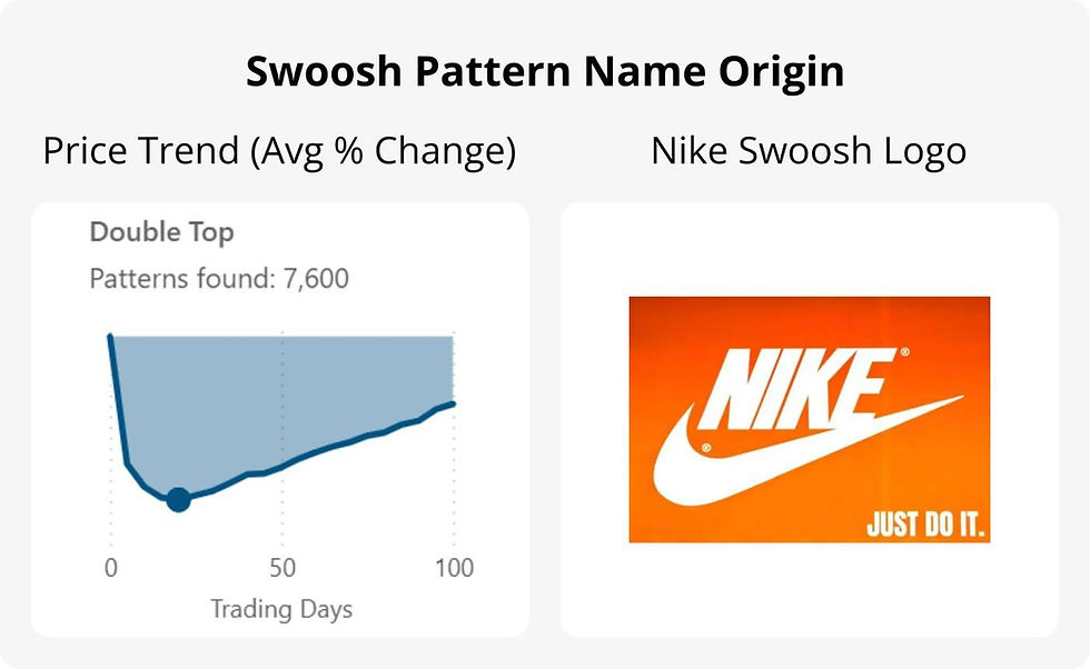
Swoosh Patterns are bearish (↘) chart patterns with down breakouts (↘) that usually rebound shortly after breakout. These reversals are different from retracements or throwbacks because they rise above breakout.
The term "swoosh" comes from the price trend of these patterns, which look like the Nike swoosh logo. By price trend, I am referring to the average % change (or expectancy) after a chart pattern forms.
Here is a comparison of the swoosh logo with the Double Top pattern's price trend. Did I name this phenomenon correctly? Let me know in the comments below.
FYI, here are a few actual stock rebound charts illustrating Swoosh Patterns in real life:


Why Swoosh Pattern is Important for Swing Reversal?
First, swoosh patterns present "buy the dip" opportunities with a holding period of 10-30 trading days. I see them as swing reversal trades for stock rebounds due to the short/mid-term duration.
Second, short selling on bearish (↘) pattern is more dangerous, especially for beginners. Swoosh patterns present a safer alternative to "go long" instead. More on that later.
What is Swing Reversal?
A swing reversal refers to a turning point in price movement during a short/mid-term trend — a moment when prices shift direction.
Swoosh Patterns presents such swing trading chances.
What is Swing Trading?
Swing trading is a short/mid-term trading strategy where traders aim to profit from price “swings” — upward or downward movements — that typically unfold over a few days to several weeks.
In her interview in Stocks & Commodities Magazine V. 27:02 (52-57), Linda Bradford Raschke, a famous floor trader, explained swing trading as:
Technically, swing trading on a 15-minute chart might mean that you are in a trade for an hour or two, and swing trading on a daily time frame might mean that you are in a trade for a week or two trying to capture a piece of that daily swing or leg. It probably should be referred to as trading 100% technically and that you are just playing for that most immediate trend, and how long you hold the trade is going to depend on the time frame you are trading on.
How I Discovered Swoosh Patterns
I was inspired by Thomas Bulkowski's book, the Encyclopedia of Chart Patterns (2005), which is probably the most comprehensive study of chart patterns supported by backtest data from 1991 to 2004 tracking over 700 stocks.
Backtest Basis
On my journey to learn technical analysis, I wanted to replicate what Bulkowski did and update the chart pattern performance metrics from 1999 to present.
Below are the parameters for my backtest:

Win Rates for Holding 30 Trading Days
I wanted to see how effective chart patterns really are, so I ran the numbers.
For each chart pattern, buy on breakout date, sell 30 trading days later.
The results? Brutal 😭
Bearish (↘) chart patterns only had win rates around 40%, like this:
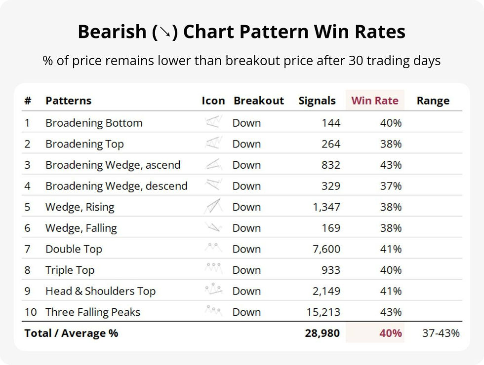
At first, I feared the technical analysis skeptics were right...... or maybe I’d messed up the data. But after triple-checking, I had to accept the numbers and start digging for answers.
Mapping the Price Trends for 10 Bearish Patterns
Instead of folding my cards, I decided to double down.
I mapped out the price trend after pattern forms for 0-60 trading days. Therefore, I drew the "flight path" to learn what usually happens after a chart pattern forms.
Again, the price trend is the average % change (or expectancy) for all the patterns found, see explanation below for why it swoosh.
When I first saw these Swoosh Patterns, I was awestruck.
What I Observed in Swoosh Patterns
The Myth: Bullish and Bearish Pattern Pairs Are Alike
Chart patterns often come in pairs. One is bullish (↗), and the other is bearish (↘), which is the inverted version (i.e. Double Top and Double Bottom).
Numerous cheat sheets and resources showcased chart patterns as flawless symmetrical snowflakes—pristine enough for office decor.

That over-perfection misled me into believing bearish (↘) setups were just mirror images of bullish (↗) ones.
They’re not.
The Truth: Bearish Pattern Trends are 59% Shorter
See chart below, the trend continues up to a certain point until it falters or changes at the Inflection Point (blue dot).
Bearish (↘) pattern trends often rebounds after the Inflection Point.
The truth?
Bearish (↘) pattern trends are shorter than bullish (↗) pattern trends by 59% on average, and varies between different patterns.

Waiting for Breakout Eroded Bearish Window
When trading chart patterns, traditional wisdom says to buy or sell on breakout. This happens when the stock price closes above or below the chart pattern range.

We now shade and overlay the average days needed to breakout for each bearish (↘) pattern trends. Some shaded area is quite close to the Inflection Point (blue dot).
You can see the shaded area eroded the bearish (↘) window by both time and price drop. In other words, by the time breakout happens, the bearish (↘) pattern trend is almost over for some patterns.
Here is the summary for both bullish (↗) and bearish (↘) pattern window:
Accidental Witnesses for Swoosh Patterns
Other observers have noted this same behavior when chart patterns act in reverse. In technical analysis, they are often referred to as "fakeout", “busted patterns” or “pattern failure.”
I prefer the term Swoosh Patterns—because they’re not rare anomalies. In fact, they occur more than half the time with a long enough holding period. Also, I specifically use this term for bearish (↘) chart patterns with down (↘) breakouts only.
Here are some collaborating witnesses.
Bulkowski is My Star Witness
As mentioned before, Bulkowski is the leading expert in chart patterns.
In Thomas Bulkowski's article, Profiting From Failure, he said:
If you’re having trouble making money trading chart patterns, then here’s an idea: Try trading busted ones.
What's a busted pattern?
Bulkowski’s definition of a failure is when a breakout occurs and the price fails to move at least 10% in the direction of the breakout, more specifically:
Price breaks out downward from a chart pattern.
Price drops no more than 10% before reversing.
Price closes above the top of the chart pattern.
Price continues rising more than 10%.
Sounds a lot like Swoosh Patterns don't you think?
My definition is simpler: Price closes above down breakout's (↘) closing price after the holding period (i.e. 30 trading days).
Bulkowski's occurrence rate for his top 5 busted patterns is between 47-63%. Meanwhile, my Swoosh Patterns average at around 60% (see data in the next section). The variance in stats arises from our different definition to quantify these rebounds.
Bulkowski also cautioned against shorting narrowing pattern types (i.e. rising/falling wedges and symmetrical triangles). This is because they have a very high reversal rate to the upside.
Character Witness Testimony Agrees
Jack Schwager in his book, A Complete Guide to the Futures Market (2017), called failed signals "the most important rule in chart analysis", and went on to say:
A failed signal is among the most reliable of all chart signals. When a market fails to follow through in the direction of a chart signal, it very strongly suggests the possibility of a significant move in the opposite direction.
Fawad Razaqzada, an analyst and economist, also observed such phenomenon in his article titled Trading The Failure Of Technical Patterns:
Most of the time, these so-called reversal patterns such as the head & shoulders formation have proven to be false technical signals, undoubtedly causing some bulls to exit their trades prematurely and trapping the sellers.
Great minds think alike!
Razaqzada went on to suggest thinking outside of the box:
Traders can take advantage by trading the failure of these technical formations, especially that of easy-to-spot topping patterns...... What I am trying to get at is that this whole trade idea was based off the bearish signal that failed to work, and how failed patterns like this can be used by traders to look for bullish trades.
Why Upside Down is the Smarter Way?
Instead of seeing these bearish (↘) chart patterns as lemons, lets make lemonade by turning them into bullish (↗) buying opportunities to "go long".
Boost Your Win Rates
By holding onto the Swoosh Patterns for 30 trading days from breakout date, we can boost the win rates from 40% to 60%. See chart below:

Deeper Profit Potential
If you wait after the Inflection Point and start buying then, the profit potential is interesting. That is, comparing to the potential for short selling. We previously established that, on average, bearish window eroded after waiting for down (↘) breakouts.
Let's extend the price trend to 100 trading days after bearish (↘) chart pattern forms. I have also included a check point at 30 trading days for ease of comparison.
The charts below give you an idea of the magnitude and duration for these Swoosh Patterns for stock rebound.
We can see that the broadening and wedge patterns almost recovers fully to when the chart pattern initially forms.
Meanwhile the topping patterns (Double Top, Triple Triple Tops and Head & Shoulders Top), along with Three Falling Peaks are still under water.
Best Swoosh Patterns for Swing Reversal
Let's find out which Swoosh Pattern has the best rebound profile.
Days Since (Run): First, we will set a range for how many days we want to set a holding period (i.e. 60 Trading Days) after the Inflection Point.
Rebound (Rise): We then measure the average % change from the Inflection Point at the end of the holding period.
Momentum (Slope): Finally, we will divide Rebound by Days Since (or Rise / Run) to get the slope to compare. The higher the momentum or slope, the more efficient the swoosh.

Below are the momentum score of each of the patterns. You can change the holding period in the dropdown menu from 35-100 trading days. See what is the impact to the momentum ranking. Select a holding period that is suitable for you.
We have also added another dimension to the ranking chart above, which is "Win Improve" or win rate improvement. This is the best improved win rate for each pattern.
The top right quadrant contains the most efficient Swoosh Patterns.
A Word of Caution on Swoosh Patterns
It's Only Averages
Swoosh Patterns are an offshoot of bearish (↘) patterns. After all, the win rate for Swoosh Patterns is around 60%, meaning a failure rate of 40%.
There is a real possibility that prices drop instead of rebound. The price trends (or expectancies) we showed are mere weighted average net values.
To drive home this point, we now show the average gains and losses that comprise expectancy.
Hover over the charts to see the values:
You can see that the blue area below the black line indicates the average size of drop if prices do not rebound.
Pay Attention to Sample Size
I also want to draw your attention to the number of patterns found. In statistics, usually the more samples there are, the more trustworthy they are.
That's also why, for chart patterns with more samples, the lines are smoother. Vice versa, patterns with lower samples has jagged lines.
How to Trade Swoosh Patterns for Swing Reversal
From theory to practice, let's look at some actual charts for Swoosh Patterns. We will also show you how to trade them step-by-step.
Since we are focusing on Swoosh Patterns in this post, the related technical analysis jargons in this section will be based on down breakout (↘) and price rebounding higher.
The charts shown in this section are for educational purposes only. The intention is to help you familiarize yourself with Swoosh Pattern stock rebounds. The charts are selected for their clarity in making a point.
Keep in mind that other charts might look similar but don’t always work out the same way. Different markets and asset classes can behave differently. So be careful and think it through before making any trades.
Step 1: Find Bearish (↘) Chart Patterns
Go to your favorite chart pattern scanner tool or website. Otherwise, use a chart pattern cheat sheet for manual identification.
My favorite is our own automated and free chart pattern screener. We scan all S&P 500 stocks every trading day.
Look at the bearish (↘) pattern column, expand to see which stock tickers have these patterns.

Step 2: Search for Down Breakouts (↘)
A breakout typically indicates a decisive shift in supply and demand, suggesting the start of a new trend.
Thus, down breakout (↘) is a confirmation signal for Swoosh Patterns.
Our chart pattern screener lets you filter for signals that have confirmed breakouts. Simply choose your time range. For example, selecting “Last 1 day” shows the latest confirmed breakout signals.

Step 3: Pencil-In an Inflection Point
Using your favorite charting tool or taking a screenshot, pencil in a possible Inflection Point for stock rebound. Here are two methods to guesstimate an Inflection Point.
Identify a Support Zone
Support zone is a likely place for rebound.
Review the price range before the chart pattern forms. If there is an area where prices have repeatedly bounced in a narrow range, that is the support zone.
These zones often appear as horizontal bands, not precise lines.
This support zone should be before and below the chart pattern. Draw a line to highlight this zone like this:


Line in the Sand: Draw with Volatility
What if there is no clear support zone?
Volatility can help estimate how far a stock might swing before reversing. The Average True Range (ATR) is a popular indicator for this.
By calculating 2x the past 1-month ATR, you can project a volatility buffer below the current price to identify a potential rebound zone.
First, find the current 22-day ATR (about 1 month) value using your charting tool.
Multiply it by 2 to get a volatility-adjusted range.
Subtract this value from the breakout price to estimate a dynamic inflection point.
This method is especially useful when price action is fast-moving or when no clear support zone exists. It helps you avoid placing inflection points too close to the breakout price. At the same time, it gives room for prices to develop into a rebound.
This indicator is also commonly used to set Stop Loss level. In our Charting Copilot, we mark this level with a dotted burgundy Stop Loss line.
Here are some examples where prices rebounded from this level:


Sometimes, the prices lingers below the Stop Loss line a bit before moving up.
Step 4: Rebound Taking Shape
If prices start to settle near the Inflection Point we found, watch for "higher highs and higher lows." This can signal a turnaround, like this:


A rebound is taking place if you see prices taking off forming a U shape, such as:


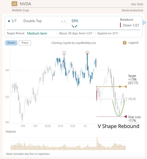
Or, things may move faster than expected, forming a V, like this:


Otherwise, if prices fall too far from the Stop Loss line, then prices may continue to slide. After all, the win rate for Swoosh Patterns is around 60%, meaning a failure rate of 40%.


Step 5: Plan Your Exit Route in Stages
Once you marked out the possible resistance levels per instructions below, ask yourself is the upside worth taking this risk? If the upside is limited, it may not be worth taking the risk. Do it only if you think the risk-reward ratio is worth your while.

Let's dive in and explain the stages in detail.
Stage 1: The Breakout Candle
Breakout is the first hurdle to clear.
Initial down breakout (↘) was a key moment when prices first signaled a bearish (↘) trend change. Thus, clearing this milestone signals price trend reversal.


Short breakout candles are easier to clear than super long ones, like these:

For super long candles, the official name is "Wide-Ranging Day." Jack Schwager in his book, A Complete Guide to the Futures Market (2017), defined as:
A wide-ranging day is a day whose volatility significantly exceeds the average volatility of recent trading days. Wide-ranging days are defined as follows:
Wide-Ranging Day = A day the volatility ratio (VR) is greater than k (e.g., k = 2.0). The VR is equal to today’s true range divided by the average true range of the past N-day period (e.g., N = 15).It's similar to the technique we introduced earlier as one way to define Inflection Point.
If prices clear this Wide-Ranging Day candle by closing above it, chances are a reversal is confirmed.


Stage 1.5: Resistances within Chart Pattern
There are a number of chart pattern features that may be hurdles to clear; here are a few examples:
Minor Low and Minor High Resistance: Turning points in price trends form peaks or valleys. The pointy shape of a recent low or high point is a resistance point for prices to penetrate.
Gap Resistance: Gaps in trading are like sudden jumps or drops in price that leave a blank space on a chart—no trades happened in that range. They often signal strong market reactions and presents upward hurdles.
Round Number Resistance: Refers to a psychological price level—like 100, or 1,000—where an asset tends to struggle to move higher. These levels often act as invisible barriers because traders naturally gravitate toward them when placing orders.


How effective are these barriers?
In Trading Basics: Evolution of a Trader, Thomas Bulkowski tested these resistances and estimates their effectiveness to be around 20-35%.
In general, sometimes prices drop right on cue and sometimes prices cruise through them with a breeze. These are features to watchout for when making a trading plan.
Stage 2: Target Line
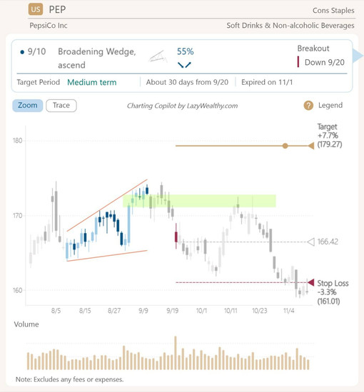
By this point, you are probably wondering, in all the charts, how come there is a gold line labeled as "Target"? And what does it mean?
In our Charting Copilot, the target line shows the average % change (gain or loss) for each chart pattern. We measure this over a holding period of 30 trading days after the chart pattern's breakout date.

The backtest data in our app is even more robust. We looked for chart patterns from the largest 1,000 stocks in the market (S&P 500 and Russell 1000) since 1999.
We use the breakout closing price from the current pattern, shown by the dotted grey line. Then, we apply the backtest average % change to find the Target.
The Target is a reference and not a recommendation.
Stage 3: Pattern Top
Chart patterns' tops or peaks are natural resistance barriers. Draw a resistance zone at pattern top to set target like this:


The upper trendline may also cause resistance to price rebounds. Extend the trendline to see if any possible hinderances.


For Three Falling Peaks, the last peak and/or each of the peak is a resistance point to beware of.


Lastly, I noticed that the rebound for the broadening pattern is often cut short at the middle of the pattern instead.


Step 6: Ride the Bulls to the Moon
First of all, congratulations!
You managed to ride a trend propelled by Swoosh Patterns from chart pattern bottom to the top and beyond like these charts:


When to Exit Beyond Chart Pattern Top?
If the chart has momentum, feel free to ride it until there is no more trend. Meaning, prices start to reverse to the downside.
A Chandelier Exit is best suited for this type of mission. It is a dynamic exit strategy used in trading to protect profits while allowing room for price movement. It is called "chandelier" because it “hangs” below the highest price reached—like a chandelier hanging from the ceiling.
Most charting tools have it, and here is an example from StockCharts.

Beware of Overhead Resistances
Look for all the support and resistance notes we discussed in this post. They may be future hurdles to beware of. Support may become resistance and resistance may become support.
Bonus Tip: What Causes the Swoosh?
The price trend I used in this post is the average % change (or expectancy) from Signal (when patterns form). This "flight path" is mapped for 0-60 trading days.
When a chart pattern forms (Signal), it can result in a gain or loss.
We use breakout as a label or separator to distinguish these gains and losses. As a result, we will have 4 outcomes as follows:

The chart below illustrates the inner workings of this price trend. We will use the Descending Broadening Wedge pattern as an example.
In the above chart, first half (orange circle) relates to up breakout (↗). Second half (green circle) relates to down breakout (↘).
Each breakout is further divided into gains (gold area) and loss (blue area).
The thick black line is the weighted average of gold and blue, forming the price trend (or flight path). This tug-of-war between the bulls and the bears is what causes the trajectory of the "price trend" you saw in this post.
In the down breakout (↘) chart for win rate (blue bars), you see an overwhelming odds for price drop initially and then eases to about even odds.
This is what causes the swoosh flight path.
Wings of Victory: Profit from Swoosh
After all the insights, data, and tactics, here is what I want you to leave with.
Your job going forward isn't about doing more trades.
It'll be about listening to what the market is trying to tell you through price actions. Swoosh Patterns are such price actions.
To amplify the market voices and make your job easier, try out our LazyCharts and Charting Copilot.
Here is the link to our free trial.
You’ll spot swing reversal profit opportunities and soar like an eagle with the wings of victory.

