- Jun 30, 2025
- 13 min read
Updated: Nov 13, 2025
Disclaimer: For educational purposes only, see full disclaimer
Why Breakout Trading Candle is Your GPS?
Backtest Blew My Mind on Breakouts
What I Learned After 69,095 Chart Pattern Breakouts
How to Use Breakout as Confirmation: Step-by-Step
@Step 1: Identify Chart Pattern
@Step 2: Wait for Breakout Trading Candle
@Step 3: Identify a Valid Breakout Setup @Step 4: Check Volume Upon Breakout
Here's the brutal truth about chart patterns:
You are SURE about spotting a bullish pattern on the chart.
You read all the books. You followed all the YouTubers religiously. You even studied a course on breakout trading candles.
BUT, you still feel uneasy about chart patterns when it's YOUR real money on the line...
If you're serious about winning in trading, you need to get accurate feedback on chart reading. You don't want to be second-guessing yourself all the time.
Well, today I'm going to show you a method that is almost as good as having a GPS to navigate chart pattern directions.
Keep reading to learn how…
Why Breakout Trading Candle is Your GPS?
When should you buy or sell?
Traditional wisdom says upon breakout.
What is Breakout?
A breakout occurs when a stock's price moves decisively beyond the boundaries of a defined chart pattern—either closing above resistance or below support. If above, an "up breakout" (↗) has occurred. If below, a "down breakout" (↘) has occurred.

Why does Breakout matter?
According to Charles D. Kirkpatrick II, CMT, author of Technical Analysis - The Complete Resource for Financial Market Technicians:
A breakout often signals that a significant change in supply and demand has occurred and that a new price trend is beginning. For this reason alone, a breakout is an extremely important signal to the investor or trader.
Technical analysts often use breakout with good volume to confirm trend direction. Thus, breakout confirmation is often used in chart pattern validation.
Generally for chart patterns:
Up breakout (↗) suggests a bullish (↗) trend.
Down breakout (↘) suggests a bearish (↘) trend.
This perspective is drawn from Thomas N. Bulkowski’s Encyclopedia of Chart Patterns (2005), widely regarded as one of the most exhaustive analyses of chart patterns. The book is backed by extensive backtesting data spanning 1991 to 2004 and covering more than 700 individual stocks.
Backtest Blew My Mind on Breakouts
I originally expected a simple backtest to confirm the obvious.
Little did I know I will be making a controversial topic even more controversial (more on that later).
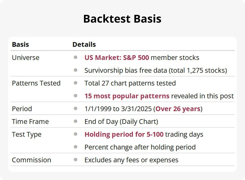
Backtest Basis
Here are the parameters I used for my backtest. My goal was to replicate Thomas Bulkowski’s original methodology and refresh the chart pattern performance metrics using data from 1999 to the present.
15 Most Popular Chart Patterns Revealed
Here is the list of chart patterns we will discuss in this post. I chose them due to online popularity. Let me know in the comments below if you have other patterns you want to know more about.

Mapping the Price Trends for 15 Chart Patterns
As a chartist, I let the chart do the storytelling.
I mapped out the price trend after pattern formation (from Signal) for 0-60 trading days. Therefore, I drew the "flight path" for both up breakout (↗) and down breakout (↘).
The price trend represents the average percentage change—also referred to as expectancy—calculated across all identified chart patterns. Further details are provided in the section below on price trend.
And, voila!
You can see that up breakout (↗) generally has a bullish trend. Down breakout (↘) has a bearish trend.
Let's dive into the insights.
What I Learned After 69,095 Chart Pattern Breakouts
Traditional Wisdom Is True, BUT...
Based on the data, traditional wisdom is correct:
Up breakout (↗) suggests a bullish (↗) trend.
Down breakout (↘) suggests a bearish (↘) trend.
You can see that after breakout (dashed line), the trend continues up to a certain point until it falters or changes at the Inflection Point (blue dot).
BUT, for down breakout (↘), traditional wisdom may not be the most practical advice for every chart pattern.
Here is why.
Down Breakout (↘) Trend is 59% Shorter than Up Breakout (↗)
Let's summarize the "Days to Breakout" and "Days in Trend" for all patterns in the chart below. You can see that down breakout (↘) trends are much shorter than up breakout (↗). See the shorter grey bars for Days in Trend for down breakout (↘) .
To be exact, down breakout (↘) bearish trends are shorter than up breakout (↗) bullish trends by 59% on average.

Breakout Erodes Profits BUT Saves Your Sanity
Let's zoom in on breakout dynamics.
By waiting for breakout, you are sacrificing profits to get clarity on the trend.
In the examples below, the average trading days for breakouts to emerge are shaded in black. The max and min (inflection points) are in blue.
Some patterns are worth waiting for breakout, as the inflection point is further away. For other patterns, the cost-benefit may be less rewarding.
This point is echoed by Jack D. Schwager in A Complete Guide to the Futures Markets, where he wrote:
Although waiting for a confirmation following breakouts will lead to worse fills on some valid signals, it will help avoid many "false" signals. The net balance of this tradeoff will depend upon the confirmation condition used and must be evaluated by the individual trader. The key point, however, is that the trader should experiment with different confirmation conditions, rather than blindly following all breakouts.
Schwager thinks that not waiting for breakout will cost you even more due to false signals.
More importantly, breakout effectiveness is different for each pattern or indicator. You won't know until you've tested them.
Keep calm and be lazy. I have already done the hard work for you.
Chart Pattern Likely Breakout Directions
The table below summarizes the likely breakout direction for the 15 chart patterns discussed in this post. They are the likely first moves after pattern formation (signal date).
These percentages are NOT the same as Win Rates, which are measured from breakout date instead.

Some chart patterns are single directional by design, hence the 100% figure.
This means they tend to break out in only one direction. If they don't breakout the correct way, the pattern is incomplete.
Up Breakout (↗) Price Trends
The chart below are up breakout (↗) for selected patterns. I choose them as they have more patterns found. Usually the more samples the better.
In the price trend, I have marked the average days it takes to breakout, Inflection Point and Check Point.
• The Inflection Point is the max point within 50 trading days.
• The Check Point is a reference marker at 30 trading days.
Down Breakout (↘) Price Trends
The period between breakout and Inflection Point is quite brief. Most Inflection Points are even earlier than the Check Point (reference marker at 30 trading days).
How to Use Breakout Candle as Chart Pattern Confirmation: Step-by-Step
Step 1: Identify Chart Pattern
You thought you saw a Head and Shoulders pattern, but you're not quite sure how to draw the neckline? The pattern is a bit lopsided; is it even a valid pattern?
This is when you start to doubt yourself...
How to Reconfirm Chart Pattern Formation?
When in doubt, reconfirm your hunch with our Charting Copilot.
Our algo highlights the pattern on the chart. We also point out the peak, trough, and trendlines that form the pattern. More importantly, the bullish (↗) or bearish (↘) trend direction resulting from the chart pattern.
There are also many other scanners you can find here. Alternatively, refer to a chart pattern cheat sheet to identify formations manually.
How to Screen for Chart Patterns in Bulk?
If you are a lazy person like me, you may not want to eyeball for every chart pattern. Instead, try our automated and free chart pattern screener. Each trading day, we perform a comprehensive scan of all stocks within the S&P 500 index.

Should You Rely Only on Chart Pattern Cheat Sheets?
Most cheat sheets are well-intentioned but oversimplified.
Chart patterns have too many details to look out for. It is impossible to condense 300+ pages of material into one cheat sheet.
Further, different gurus have different opinions about the subject. Here are 2 examples:
Most Patterns Have BOTH Up and Down Breakouts
Based on Bulkowski's and my own backtest, most chart patterns have both up and down breakouts.
Let's look at Google Search's first-place result for chart pattern cheat sheet. It shows one-sided breakout only for most patterns.

Up Breakout Trends Last Longer than Down Breakout Trends
Before doing the backtest, I never realized that some down breakout trends are so short.
Cheat sheets like this gave me the impression that up and down breakout trends last about the same time. They drew the up and down arrows the same size. Perhaps they don't even know that down breakout trends last shorter...

Conflicting Info from Cheat Sheets
If you compare the above 2 cheat sheets, you will notice the devil is in the details.
The direction arrows are not consistent on the 2 cheat sheets. One cheat sheet shows the chart pattern breakout only in one direction. The other cheat sheet displays both directions.
I don't think these cheat sheets are wrong. I think they try to communicate a basic idea of how to read these patterns with different emphasis. Again, the limitations are due to the numerous and onerous details in chart patterns.
With so many cheat sheets online and some offering conflicting info, who do you believe? I believe in cheat sheets backed by solid evidence. This can be from back testing, a book or detailed analysis.
Step 2: Wait for Breakout Trading Candle
After you find the chart patterns, add the stock tickers to your favorite watchlist for monitoring.
Your trigger finger is itching to hit the buy button.
BUT, hold your horses...
The wait may be slightly longer than you expected.
How Long Should You Wait for Breakout?
Breakouts usually happen from 3 to 15 trading days after a chart pattern forms. The average is about 9.4 trading days. Here is a list of the average days to breakout for chart patterns. For simplicity, the Cup and Holder pattern is excluded from the average, min and max calculations.

When Should You Give Up Waiting for Breakout?
Most breakouts happen within 30 trading days after a chart pattern forms. I have also marked in blue, where over 80% of breakouts have first occurred.
The widening pattern types take the longest to breakout, and the narrowing patterns the shortest. This is due to the construct of the pattern shape.

Keep in mind these are averages. Breakouts can happen sooner or later than these average values.
If you don’t see a breakout for longer than the table indicated, the chart pattern may no longer work. As you can see, some breakouts last over 50 trading days; do you really want to wait that long?
Step 3: Identify a Valid Breakout Setup
First, you have to have something to breakout from. A chart pattern is usually such an occasion.
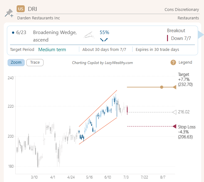
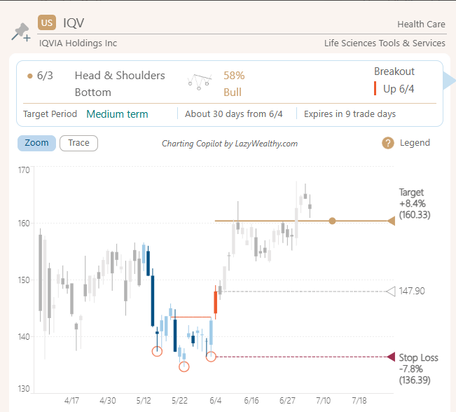
A breakout occurs when price exceeds a prior support or resistance zone. In other words, above or below the chart pattern range. Here are a few chart pattern breakouts for you to practice seeing it. The grey dotted line points to the closing price on breakout date.


Breakout following the previous trend is confirming that the trend still exists. Breakout in the opposite direction of the previous trend means it is reversing.
How to Identify Breakout Confirmation?
For daily charts, closing price is the simplest way to determine breakouts.
A chart pattern is confirmed to be bullish or bearish when the latest closing price penetrates the top or bottom of the pattern range.
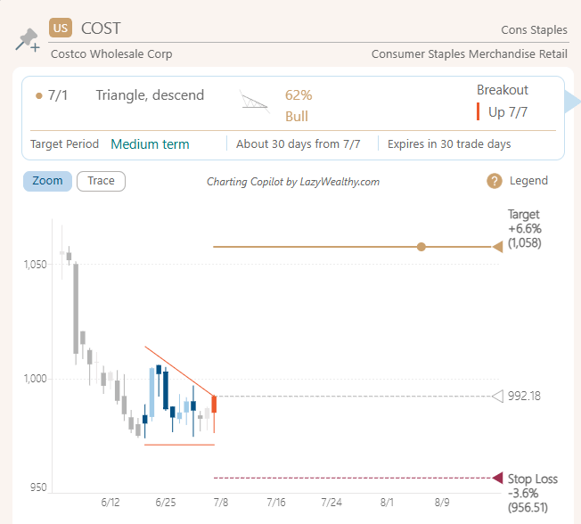
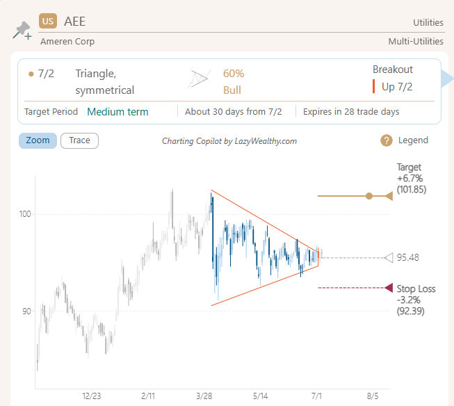
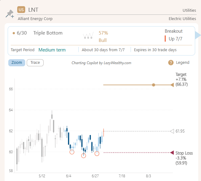
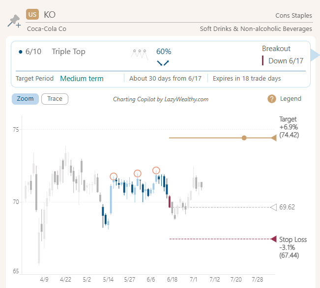
If you are still unsure, our app labels the breakout point for each chart pattern. Up breakout (↗) is an orange candle, while down breakout (↘) is a burgundy candle.

How to Avoid False Breakout?
The safest way to confirm a breakout is with the closing price. The odds of false breakouts are higher when using the daily high or low price.
If you set alerts for pattern breakouts, don’t get too excited when you see a notification during trading hours (intraday). Wait for the close and trade the next trading day.
To avoid false breakouts, you can also set a percentage limit beyond the breakout level. Or wait for 2 bar closes beyond breakout level for confirmation.
BUT, the trade-off between profitability and assurance is a choice you have to make.
Step 4: Check Volume Upon Breakout
Check the volume on breakout date to see if the trading volume is higher than usual.
High trading volume shows that more investors trust the new trend. It also means there is enough strength behind the breakout. In other words, one side (bull or bear) has won the tug-of-war for that trading day to cause prices to go up or down.
How to Define High Volume Breakouts?
Bulkowski defines high trading volume as more than twice (2x) the normal volume. See Bulkowski article in Stocks & Commodities Magazine V. 22:6 (18-22), titled Does Volume Matter?
High Volume Breakout = Breakout Date Volume > 2 * Normal VolumeNormal Volume = Past 3 Month Average VolumeI have tried 1.5x the normal volume, which also works. More on that later.
Does Volume Matter for Chart Pattern Breakouts?
That is a resounding YES!
In the article mentioned before, Bulkowski tested 26 chart patterns and concluded that:
If you trade a chart pattern often enough, those with high volume will tend to perform better than those with light volume... Most chart patterns will outperform if they have heavy breakout day volume.
I have compared the price trends for the chart patterns with heavy breakout day volume below. The dotted line is for heavy breakout day volume. My results agree with Bulkowski's conclusions.
The dotted price trend is a bit deeper, and the trend lasts a bit longer.
In the above chart, the dotted line is, by default, set to 2.0x normal volume on breakout date. You can also adjust it to 1.5x normal volume. There are still outperformance, but less than 2.0x. The tradeoff is with 1.5x, you get more trading opportunities.
Is High Volume Breakout Common or Rare?
When we apply the high volume rule, we are being more selective. Therefore, the trading opportunities will also be less. 2.0x normal volume is only 18% of the total patterns found, while 1.5x normal volume is 33%.

It is also surprising to see that for down breakouts (↘), high volume breakouts are more common than up breakouts (↗).
Are there Exceptions to Breakout Volume?
However, in Bulkowski's backtest (same source above), 4 out of 26 patterns perform slightly better with light volume on breakout, which are:
Diamond tops, down breakout
Eve & Adam double bottom
Ascending triangles, down breakout
Descending triangles, upward breakout
Bulkowski's comment on these exceptions is:
My point is simple: Just because your chart pattern may have heavy volume, that is no guarantee it will outperform one with light volume.
Based on my backtest 3 out of 15 patterns did not perform better with high volume breakout candles. Here are the exceptions:
Falling Wedge, down breakout
Triple Bottom, up breakout
Cup and Handle, up breakout
Step 5: Determine Bullish or Bearish Trend
As mentioned earlier, an up breakout (↗) typically signals a bullish trend, while a down breakout (↘) indicates a bearish trend. These directional moves are crucial for anticipating price momentum after a pattern completes.
Some chart patterns are single directional by design, meaning they tend to break out in only one direction. For example, a cup and handle pattern by definition only has up breakout (↗).
Below is a list of the 15 chart patterns featured in this post. When you factor in both breakout direction and gain/loss scenarios, you end up with 42 possible outcomes.
That’s a lot to memorize and track manually...

How to Determine Up or Down Trend?
Fortunately, we’ve built all this logic into our Charting Copilot for ALL 22 chart patterns, so you don’t have to analyze each pattern from scratch.

Our tool includes:
Breakout direction (↗ or ↘)
Historical win rate
Average gain/loss after breakout
When you study a pattern in detail, you’ll see all this data in one place—no need to flip through cheat sheets or second-guess your setup.
To simplify things further, our algorithm also considers the prior trend leading into the pattern. This helps us classify the expected outcome as either:
Bullish (↗) — likely to continue or reverse upward
Bearish (↘) — likely to continue or reverse downward
Other resources may categorize patterns into four buckets:
Bullish continuation
Bullish reversal
Bearish continuation
Bearish reversal
We’ve distilled that into just two outcomes—Bull or Bear—to make decision-making faster and more intuitive.
Why Do Prices Often Pull Back After a Breakout?
It’s common to see a brief retreat after a breakout. These are known as:
Throwback — when price pulls back after an up breakout (↗)
Pullback — when price bounces after a down breakout (↘)
These moves often retest the breakout level, acting as a final check before the trend resumes. While there’s no strict definition, experienced traders recognize them by their behavior: a short-lived dip that doesn’t invalidate the breakout.

Understanding these nuances can help you avoid premature exits—or worse, getting faked out.
Step 6: Plan When to Exit
As mentioned before, bearish trends from down breakouts (↘) are 59% shorter than bullish trends from up breakouts (↗).
For up breakout (↗), expect a holding period to ride the bullish trend of about 30-50 trading days from breakout date.
For down breakout (↘), depending on the pattern, expect a much shorter holding period of about 3-20 trading days from breakout date. Anticipate a rebound afterwards.
Down breakout (↘) does not mean shorting only. If you have shares, expect short-term turbulence. You may even consider selling now to buy them back later at lower prices after the coast is clear.
The holding periods indicated are averages for reference. When trading, it's best to monitor continuously to your desired target or stop loss level.
Bonus Tip: What is Price Trend?
In this post, the price trend refers to the average percentage change—also known as expectancy—measured from the point a chart pattern emerges (the Signal). This trajectory or "flight path" is tracked over a 0 to 60 trading day window.
When a pattern forms, it may lead to either a price increase or decrease. To categorize these outcomes, we use the breakout event as a defining marker. This approach yields 4 distinct result types, outlined below.

The chart below provides a visual breakdown of how the price trend unfolds over time. We will use the Broadening Top pattern as an example.
In the chart above, the top half (orange circle) shows what happens when prices break out upward (↗), while the bottom half (green circle) shows downward breakouts (↘).
Each breakout is split into two parts: gains are highlighted in gold, and losses are shown in blue.
The thick black line shows the weighted average of the gold and blue areas, which creates the overall price trend—or flight path. This line reflects the push and pull between buyers (bulls) and sellers (bears), and that back-and-forth is what shapes the swoosh curve of the "price trend".
Here is how to calculate expectancy:
Broadening Top up breakout (↗) expectancy at 50 trade days is calculated by weighting the average gain or loss with win rate:
Expectancy = (+9.66% * 78%) + (-7.16% * 22%) = +5.88%Broadening Top down breakout (↘) expectancy at 20 trade days is calculated by weighting the average gain or loss with win rate:
Expectancy = (+3.94% * 36%) + (-6.02% * 64%) = -2.40%Pro Tip: Expectancy tells you whether a pattern is worth trading. The higher the expectancy, the better. When trading these patterns, gain or loss may be used as a target reference.
Take Your Trading Skills to the Next Level
Knowing how to spot and use breakouts when trading chart patterns is just the beginning.
The real impact comes from implementing it at scale and with precision.
To expand your success and confidence, take it a step further by automating this process with Charting Copilot.
Here is the link to our free trial.
You've got the foundation from this guide, but there's always benefits in a partner to double-confirm your thesis.